A New Look for a New Era in I.T.
Aerocom came to Wowwee Design ready to evolve. Their tech services were forward-thinking, but their visual identity wasn’t keeping up. So we stepped in with a full brand overhaul — logos, website, campaign and content — creating a bold, clean digital presence that speaks the language of innovation and trust.
Rebranding That Means Business
We didn’t just “make it look good.” We built a brand designed to win business and build confidence. The new identity system gives Aerocom the credibility and clarity needed in a competitive, jargon-heavy market. The result? An I.T. company that finally looks as smart as it works.
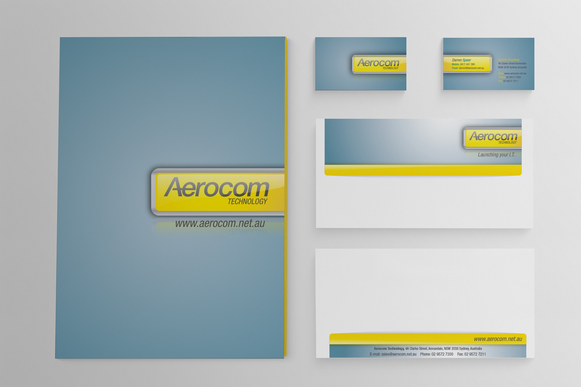
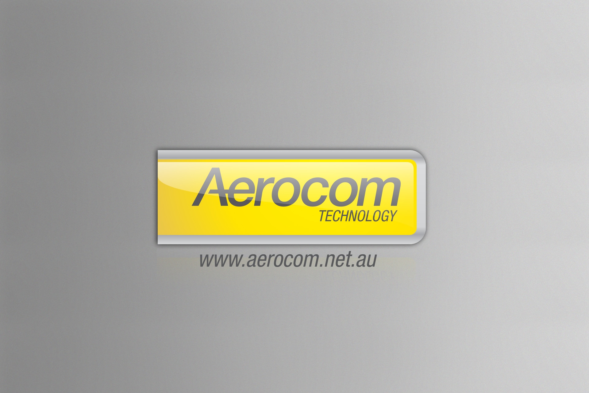
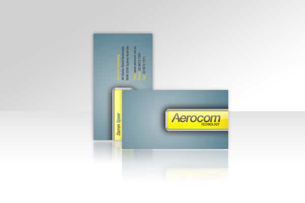
Logos That Speak Tech with Style
At the core of the rebrand was a set of modern, flexible logos that balance precision and personality. The new mark works across devices, print and digital, standing out in a space where so many I.T. companies fall into a sea of sameness.
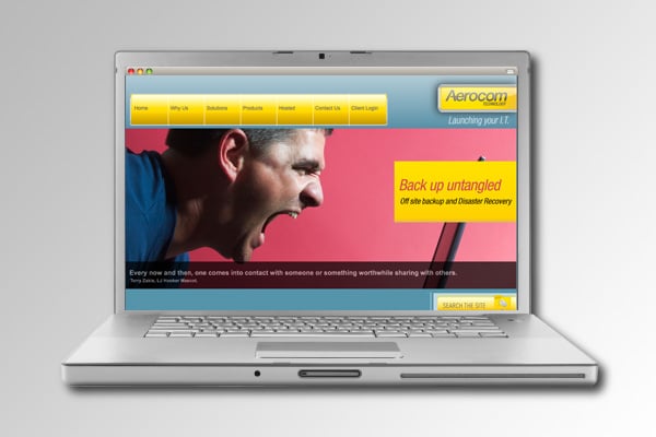
A Website With Brains and Beauty
Aerocom’s website was built with a custom backend, meaning every element was tailored to their needs — from intuitive content management to an effortless user experience. Sleek on the outside, robust on the inside: just like the company itself.
Messaging With Clarity and Confidence
In I.T., it’s easy to lose people in technical talk. So we rewrote their story with clarity, warmth and confidence. Clear headings, approachable language, and a tone that shows expertise without arrogance. It’s branding that builds trust, not confusion.
People-First Technology
Aerocom’s strength lies in its team — engineers who’ve been solving complex problems together for over a decade. We highlighted this personal service in the branding, showing they’re not just technical wizards, but human problem-solvers too.
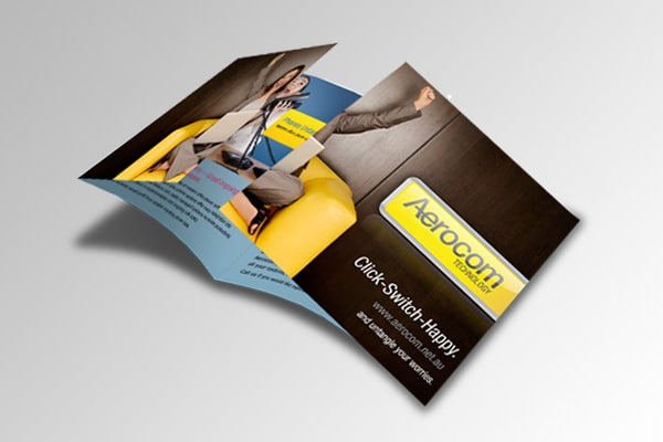
Designed to Break I.T. Stereotypes
Let’s face it: most I.T. branding is dated, dull or too data-heavy. We flipped the script, giving Aerocom a design language that’s vibrant, sharp and genuinely engaging. Because standing out starts with looking the part.
Service Levels That Make Sense
We simplified the way Aerocom communicates its Service Level Agreements (SLAs). The updated design and copy clearly map out value, showing customers what they get — not what they’re guessing. It’s design that informs, not overwhelms.
No Hourly Guesswork. Just Results.
Too often, I.T. companies focus on billing hours. Aerocom’s model is smarter — you pay for outcomes, not time. We made that a core message in the brand, reinforcing their point of difference through punchy language and bold graphics.
Collaboration Was the Key
Working with Darren, Carlos and Justin was a dream. They trusted the process, gave great insights, and championed the design direction at every step. When founders are on board, the results speak for themselves — and this brand now does just that.
I.T. Branding That Gets Noticed
From backend build to front-end flair, we’ve helped position Aerocom as a standout in the I.T. space. It’s a brand built on clarity, creativity and real-world credibility — proving that even in tech, personality and design make all the difference.