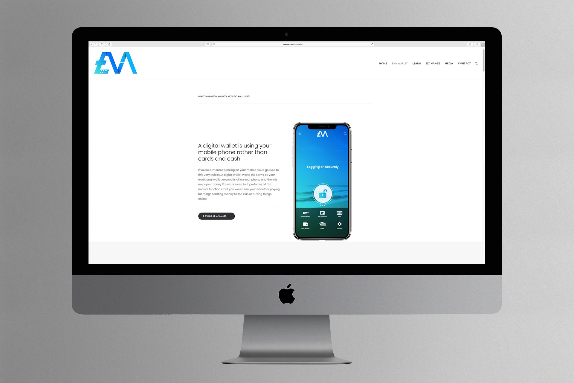
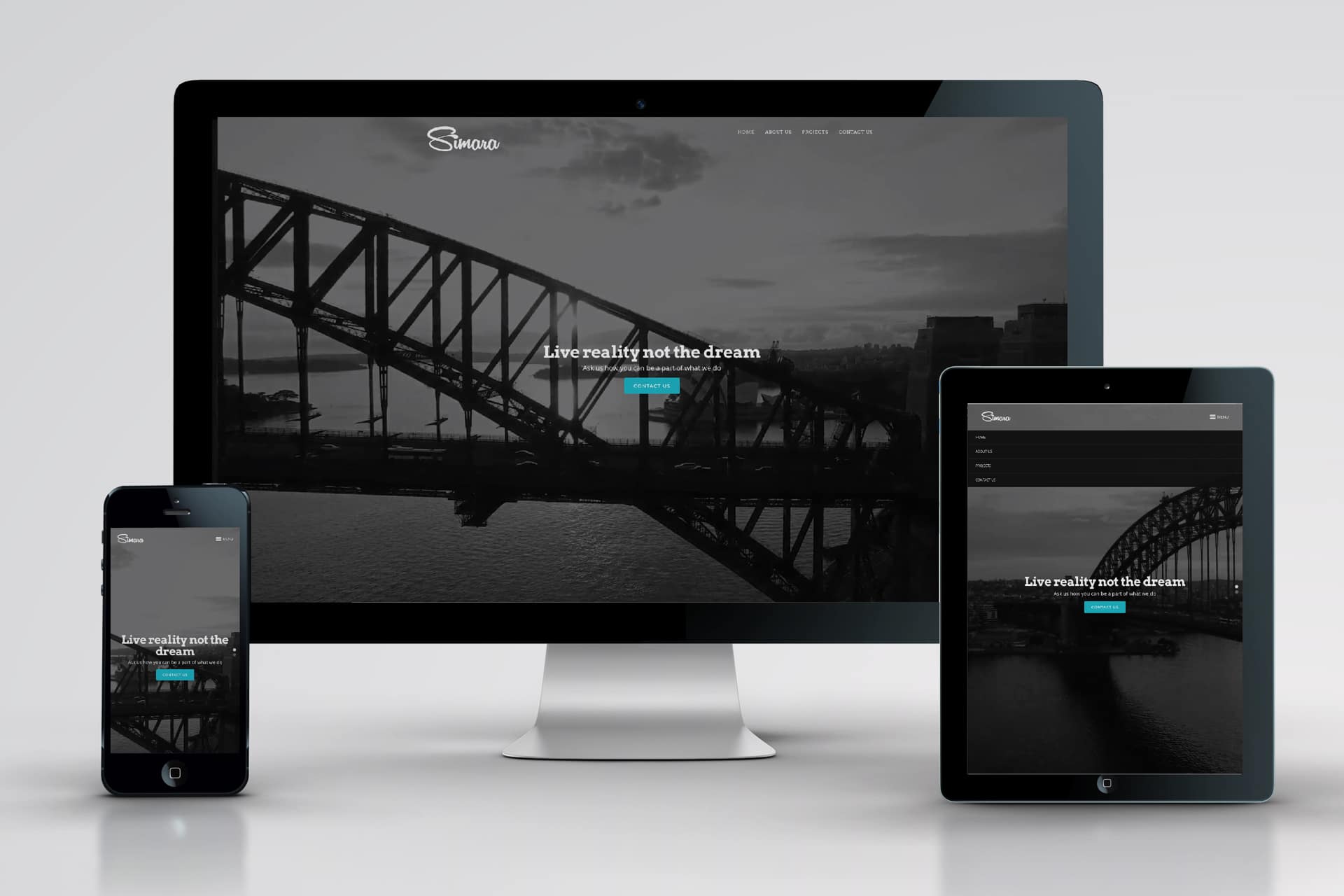
Software That Deserved Better
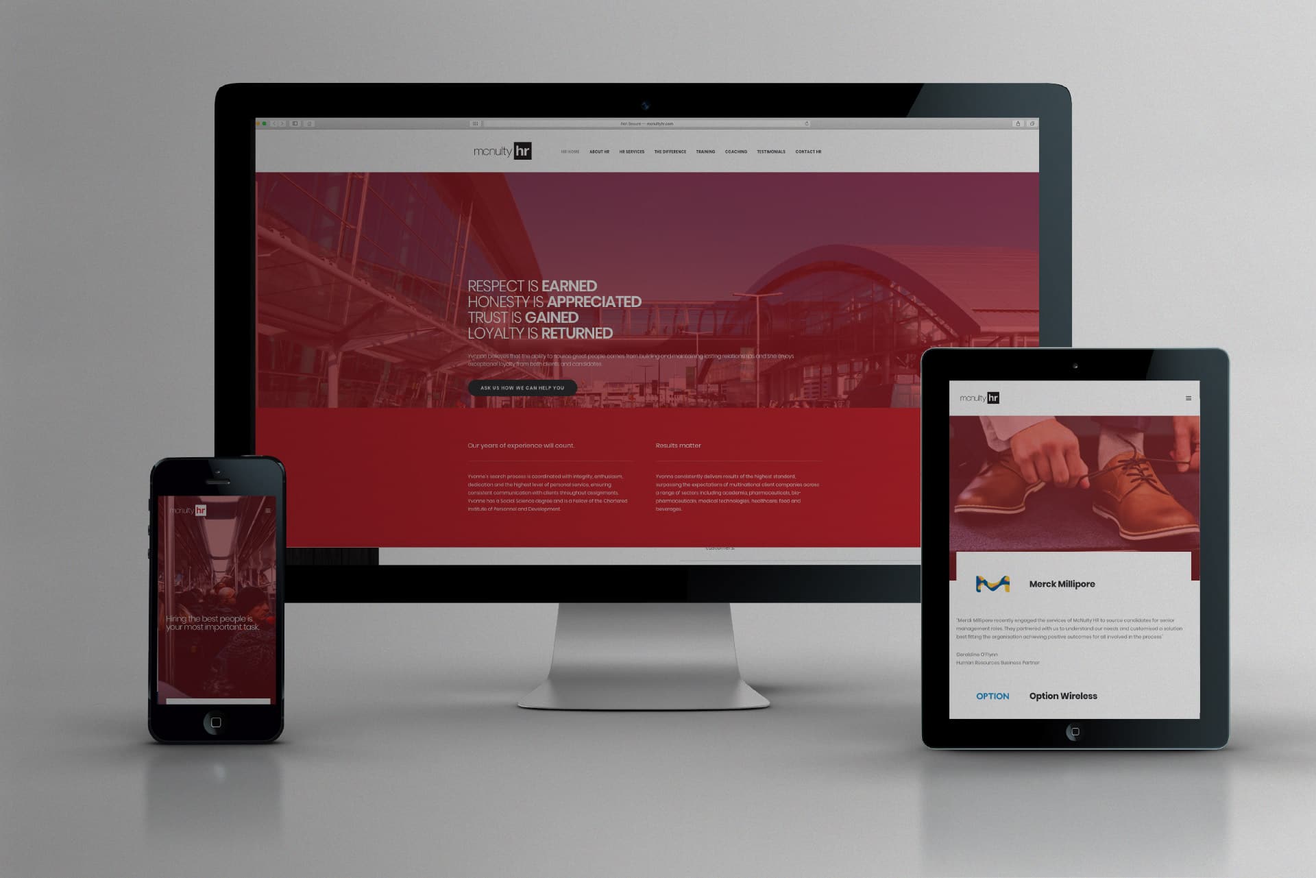
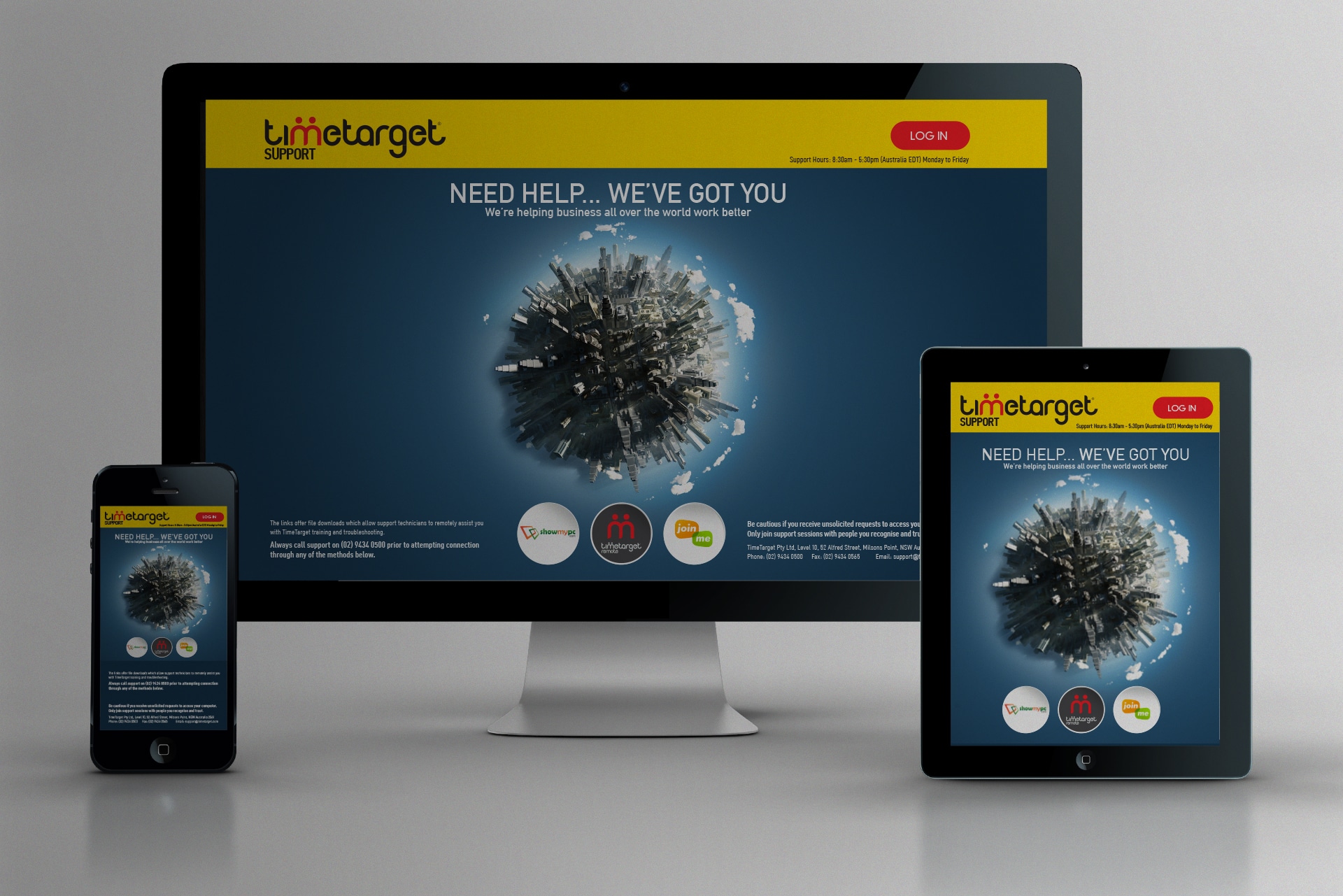
Not all software is created equal. TimeTarget, now known as Humanforce — is a powerful workforce management platform. But like many enterprise systems, its interface was stuck in a time warp. Clunky, outdated, and overloaded. We saw an opportunity to redesign the user experience into something far more intuitive, engaging, and human.
Goodbye Spreadsheets and Sticky Notes
Humanforce replaces thousands of manual spreadsheets, Post-its, and payroll headaches. But software is only as good as the experience it delivers. Our goal? Design a smarter, cleaner interface that made everyday tasks easier for staff and managers, not harder.
Where the Design Brief Began
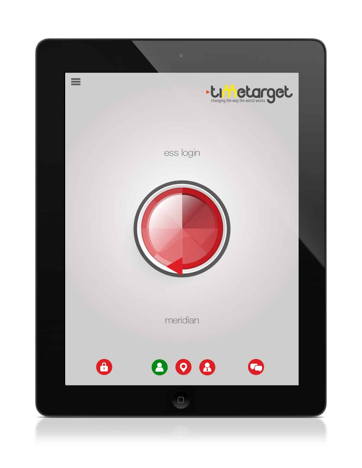
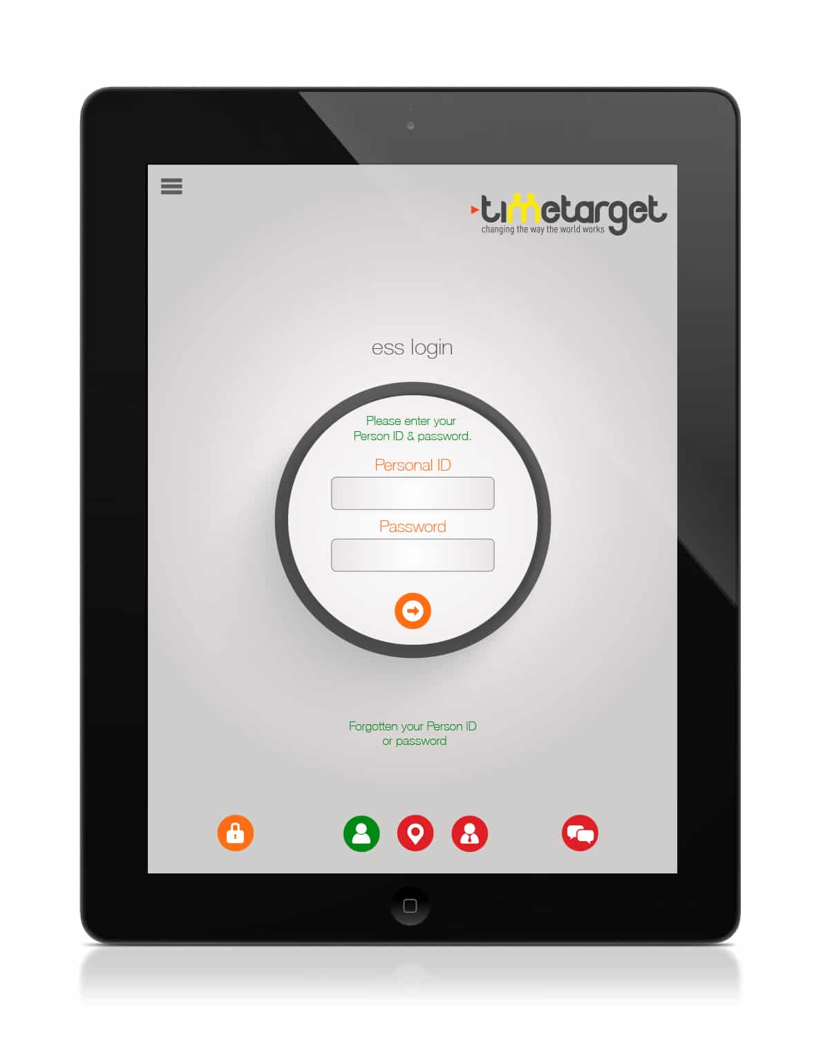
I logged into the demo site and, bluntly, I was underwhelmed. Everything felt like it had been built for 1980. As a designer inspired by Apple and Google’s best, I knew I could rethink it all from the ground up, and I did.
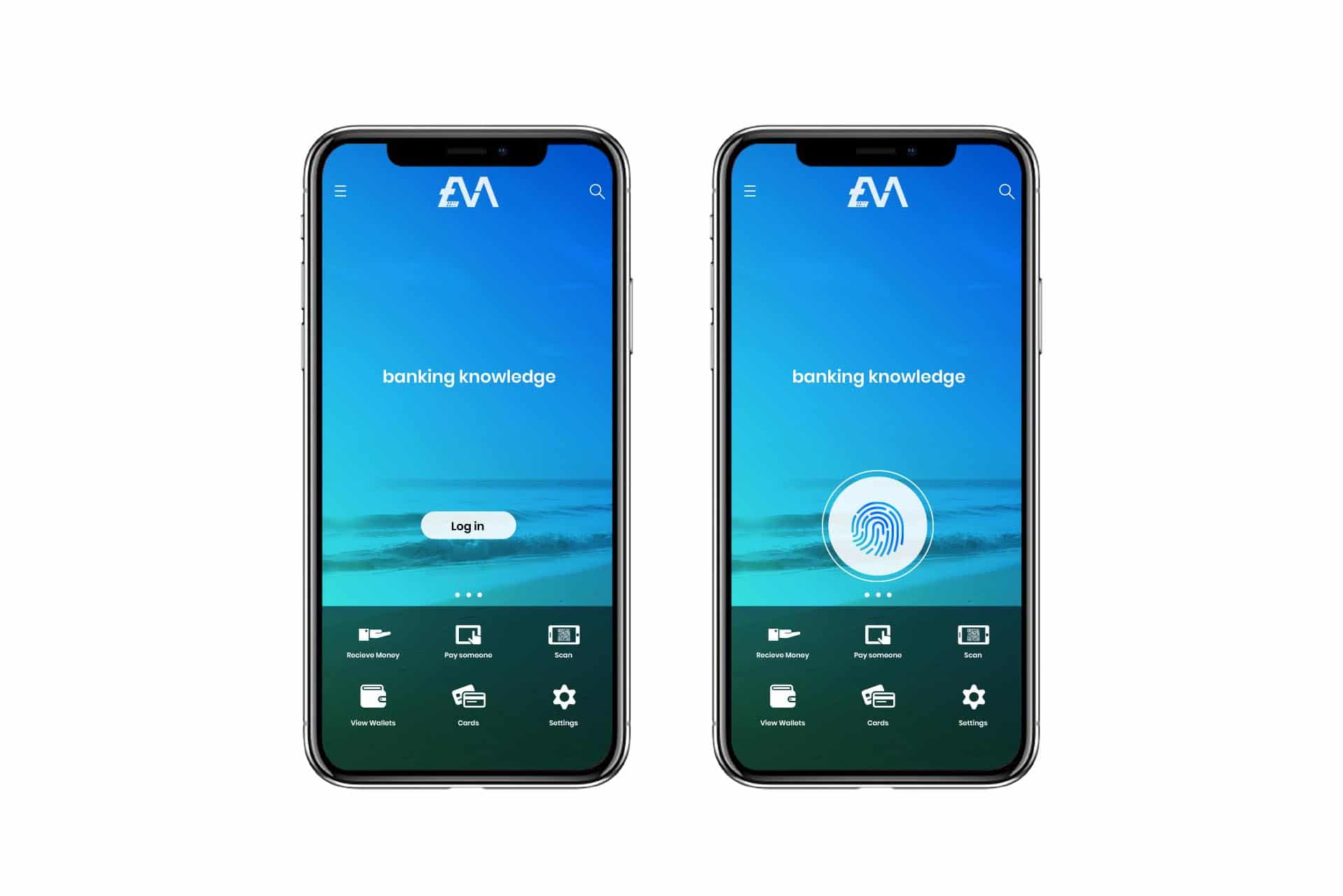
Start at Zero, Not Version 9.1
Great design doesn’t layer lipstick on legacy. It starts at zero. We scrapped the clutter, ditched the drop shadows, and built from whitespace and clarity. Flat icons. Logical spacing. Modern UI elements that breathe.
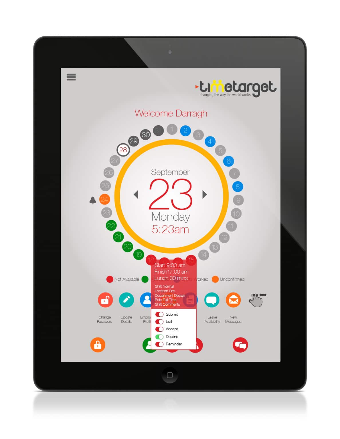
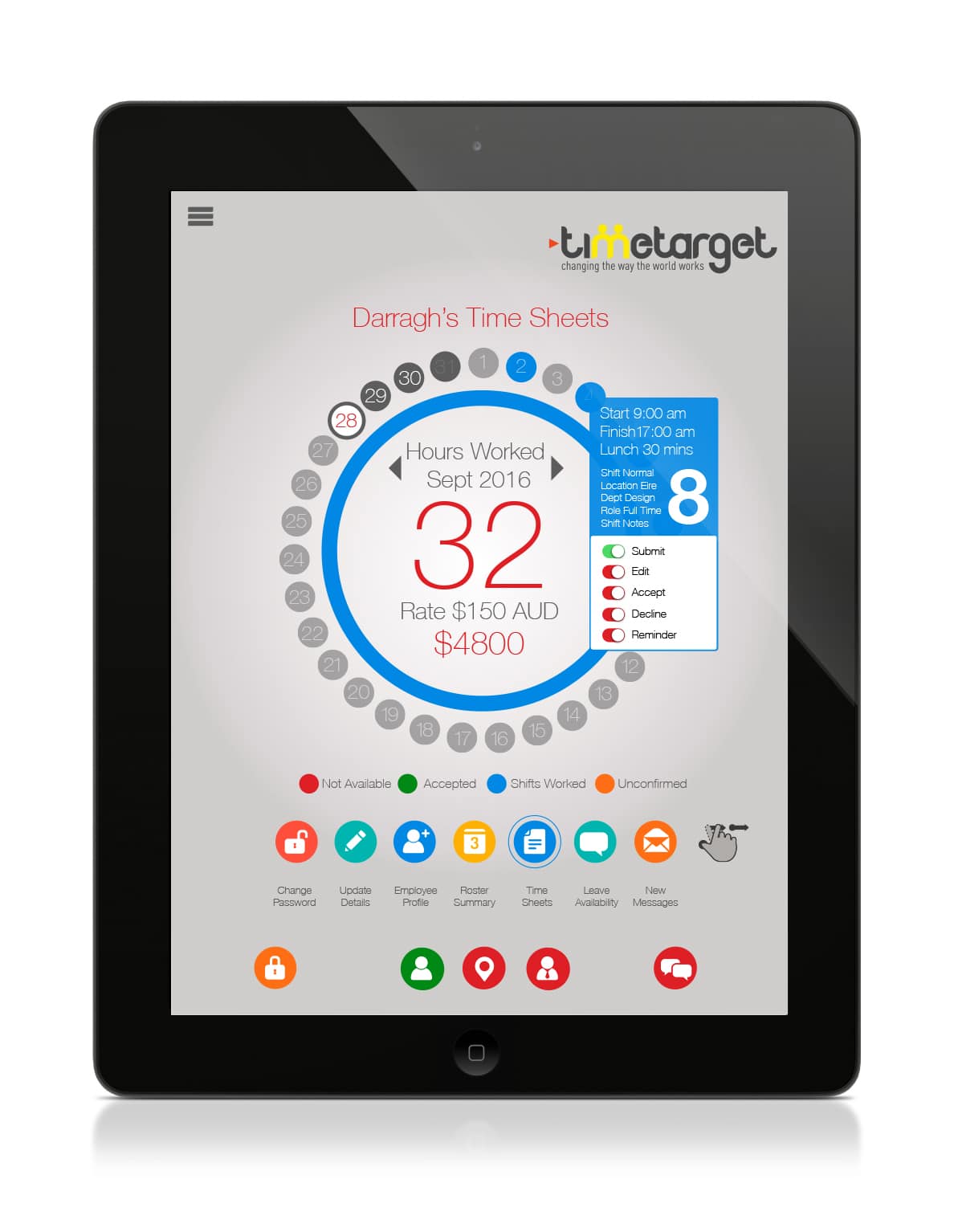
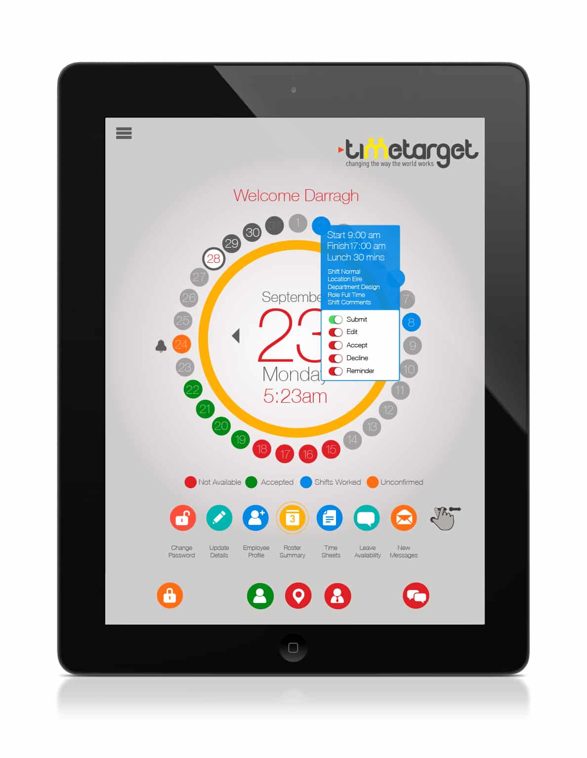
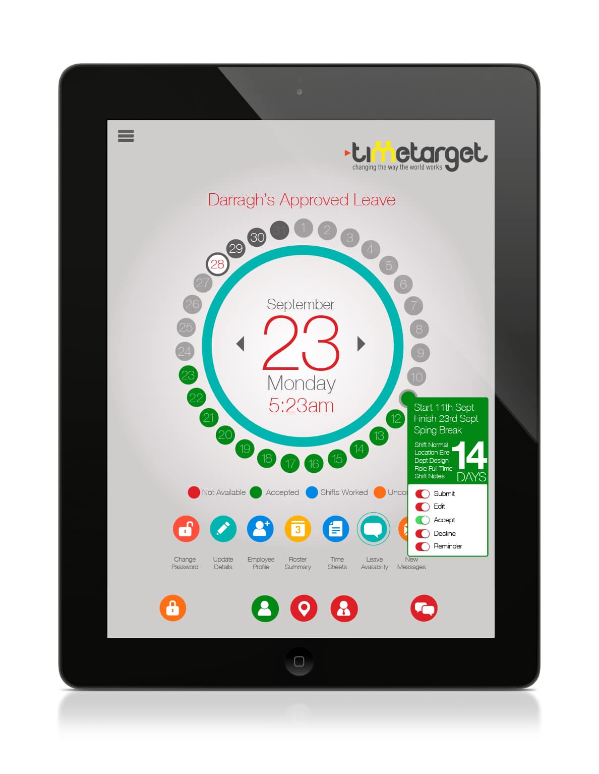
Colour That Communicates Instantly
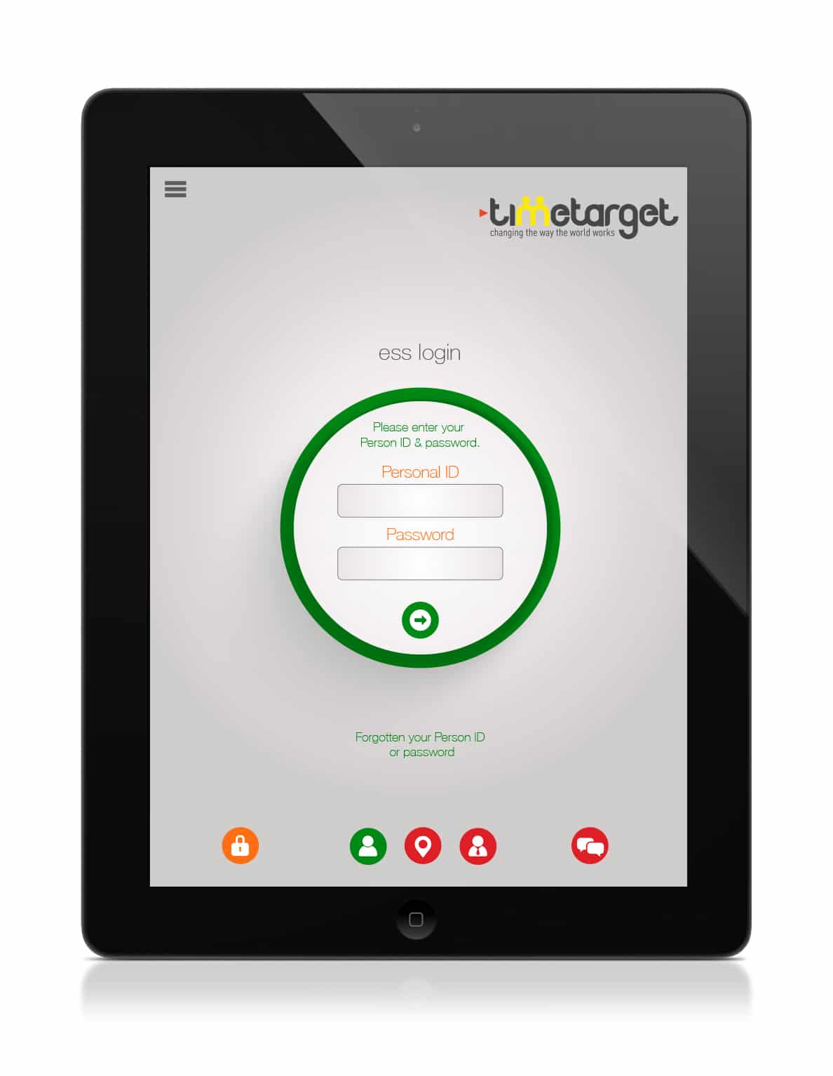
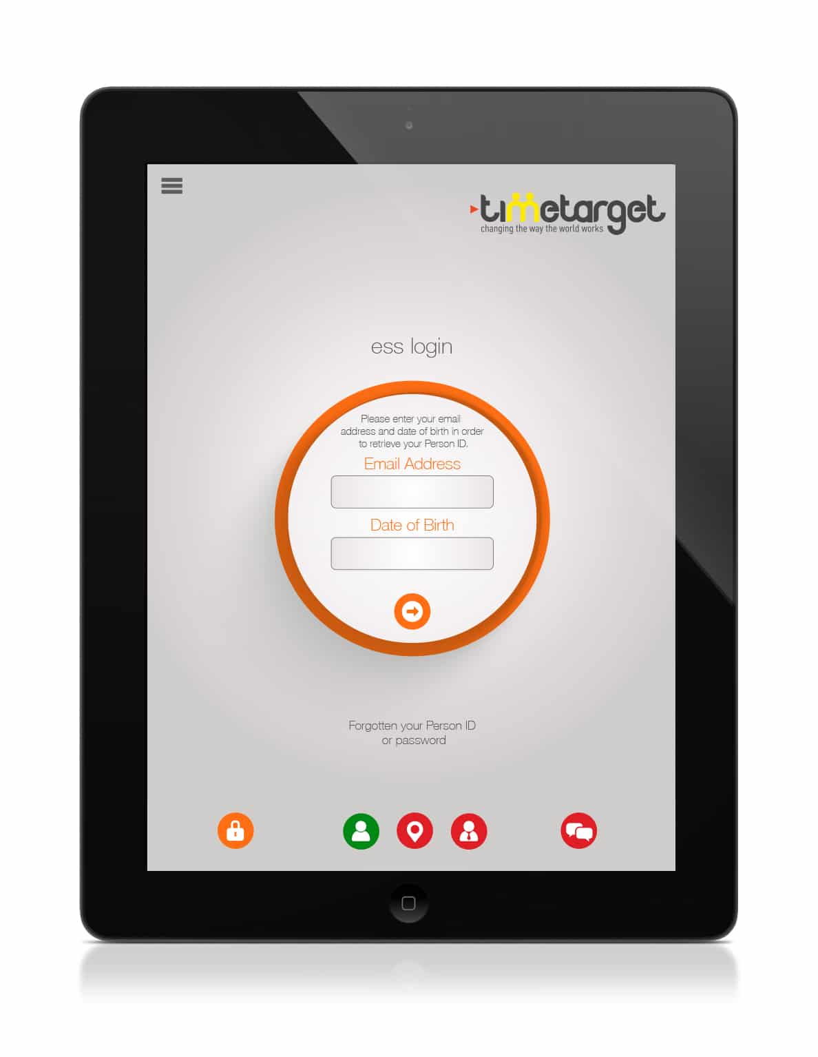
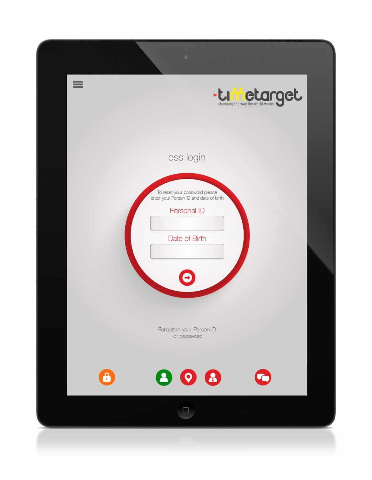
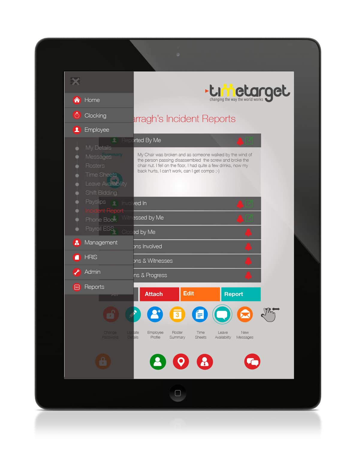
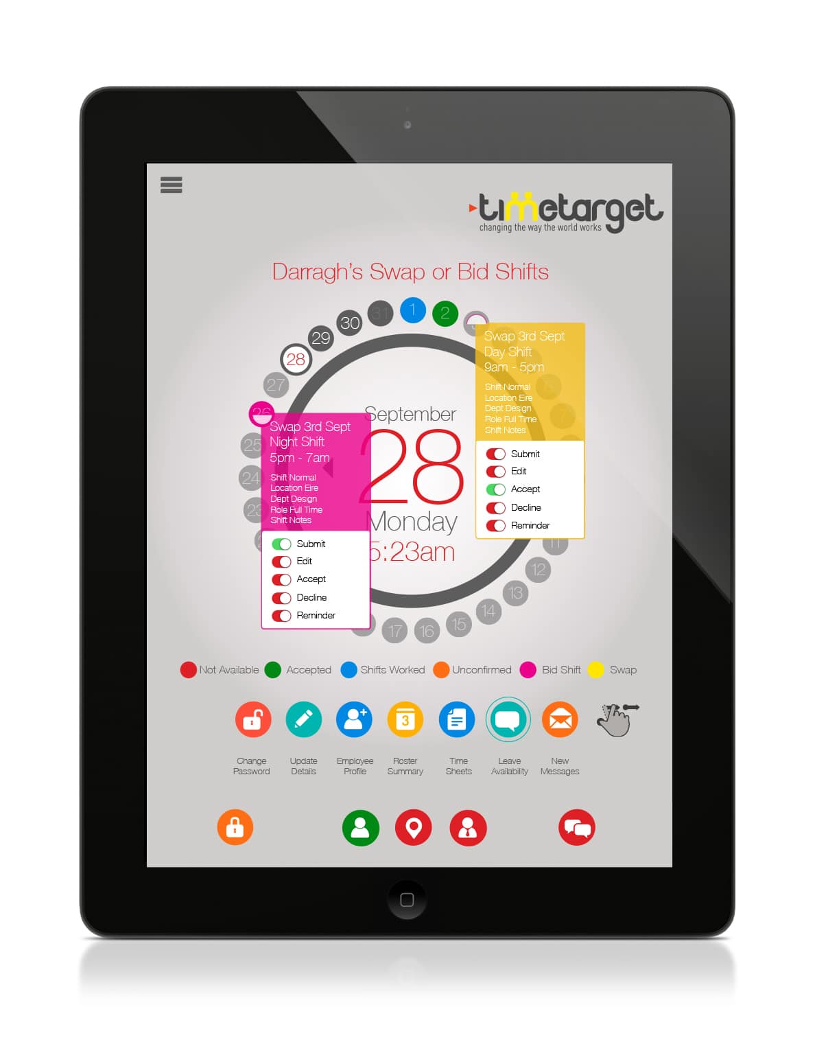
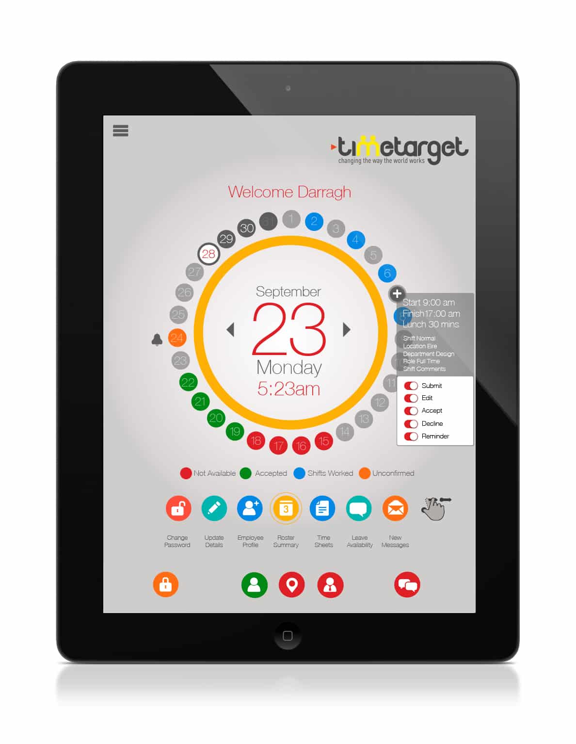
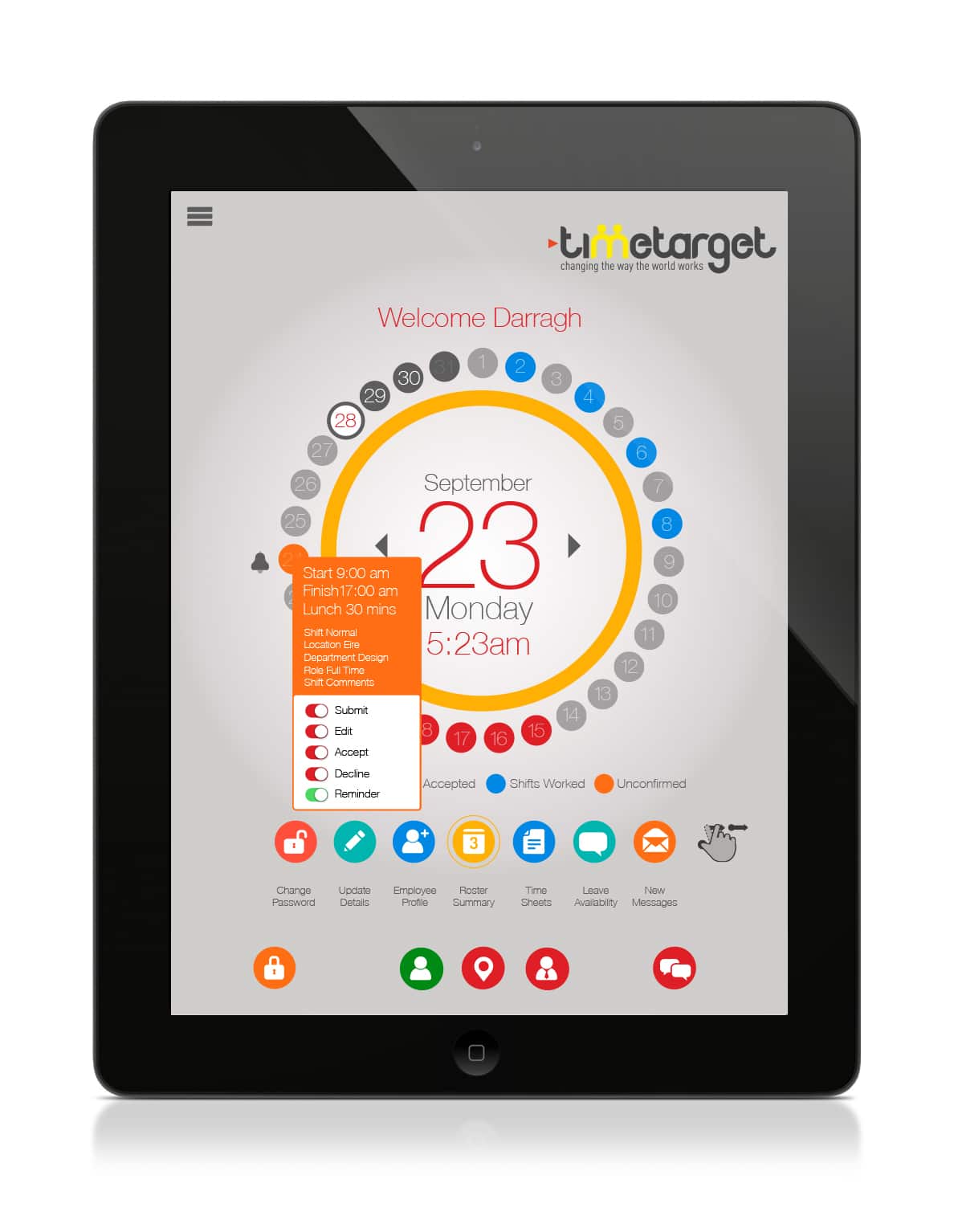
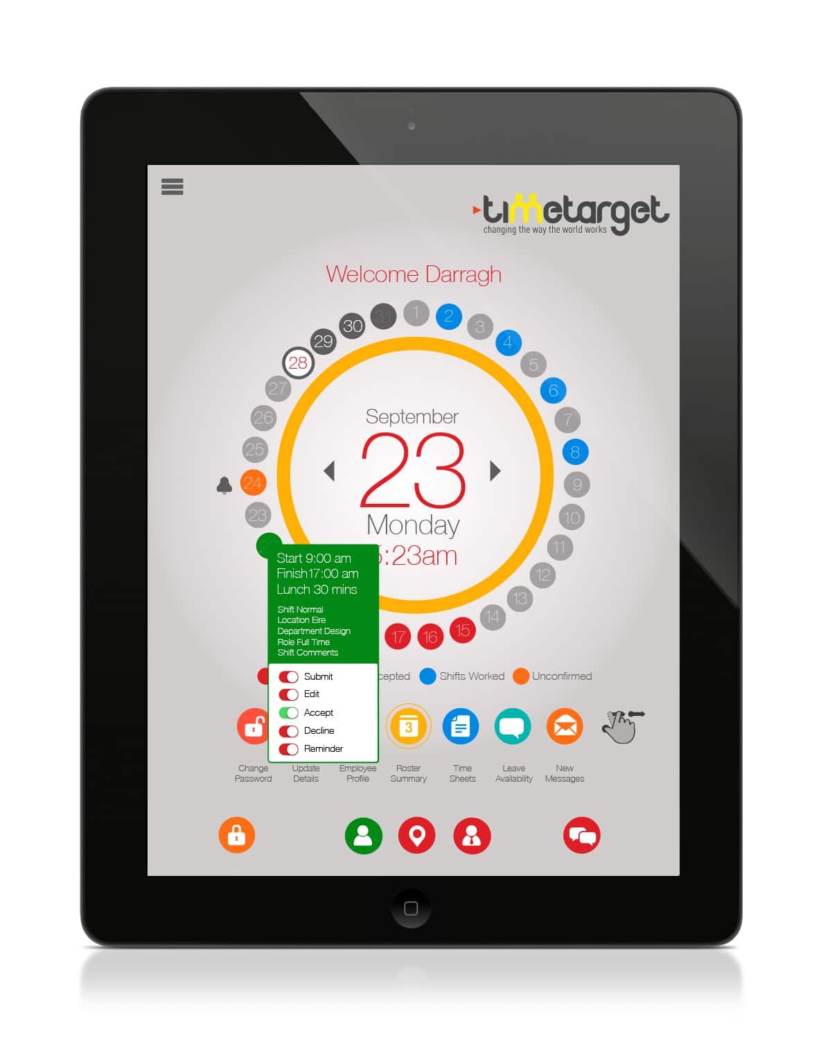
We introduced a clear colour hierarchy using a familiar visual cue, traffic lights. Red = Wrong. Orange = Try Again. Green = Correct. A universal system, already hardwired into how we think and move. Why complicate it?
Menus That Don’t Make You Think
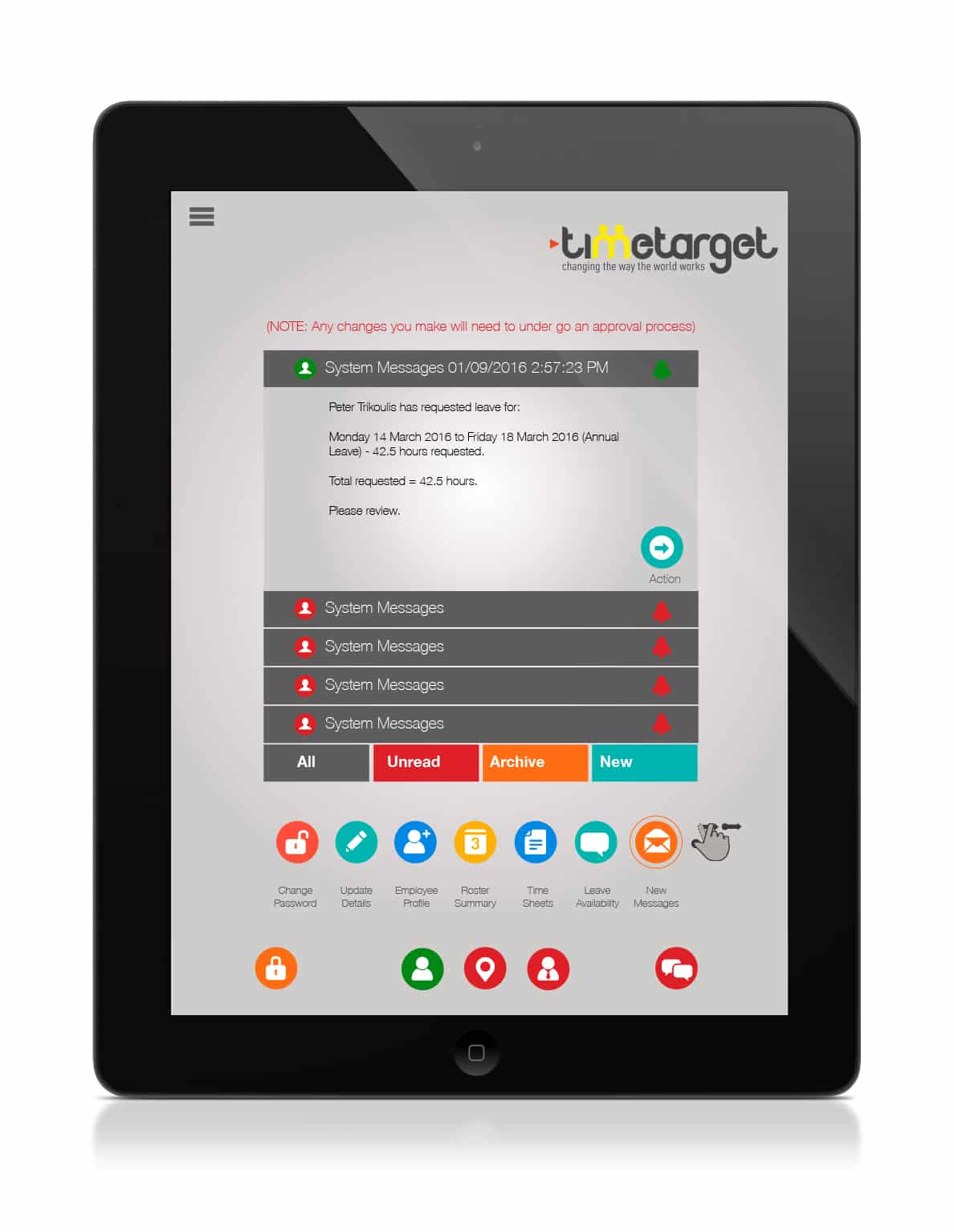
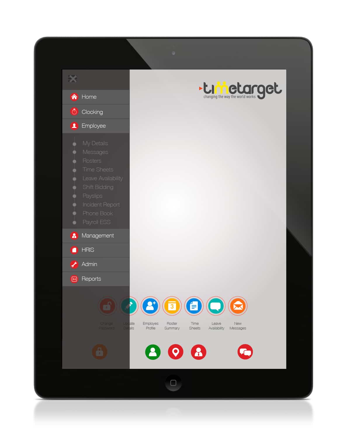
Menus should guide, not confuse. We restructured the navigation around frequency of use. Staff want to check shifts. Managers want to approve them. One function per button. Simple. Predictable. Fast.
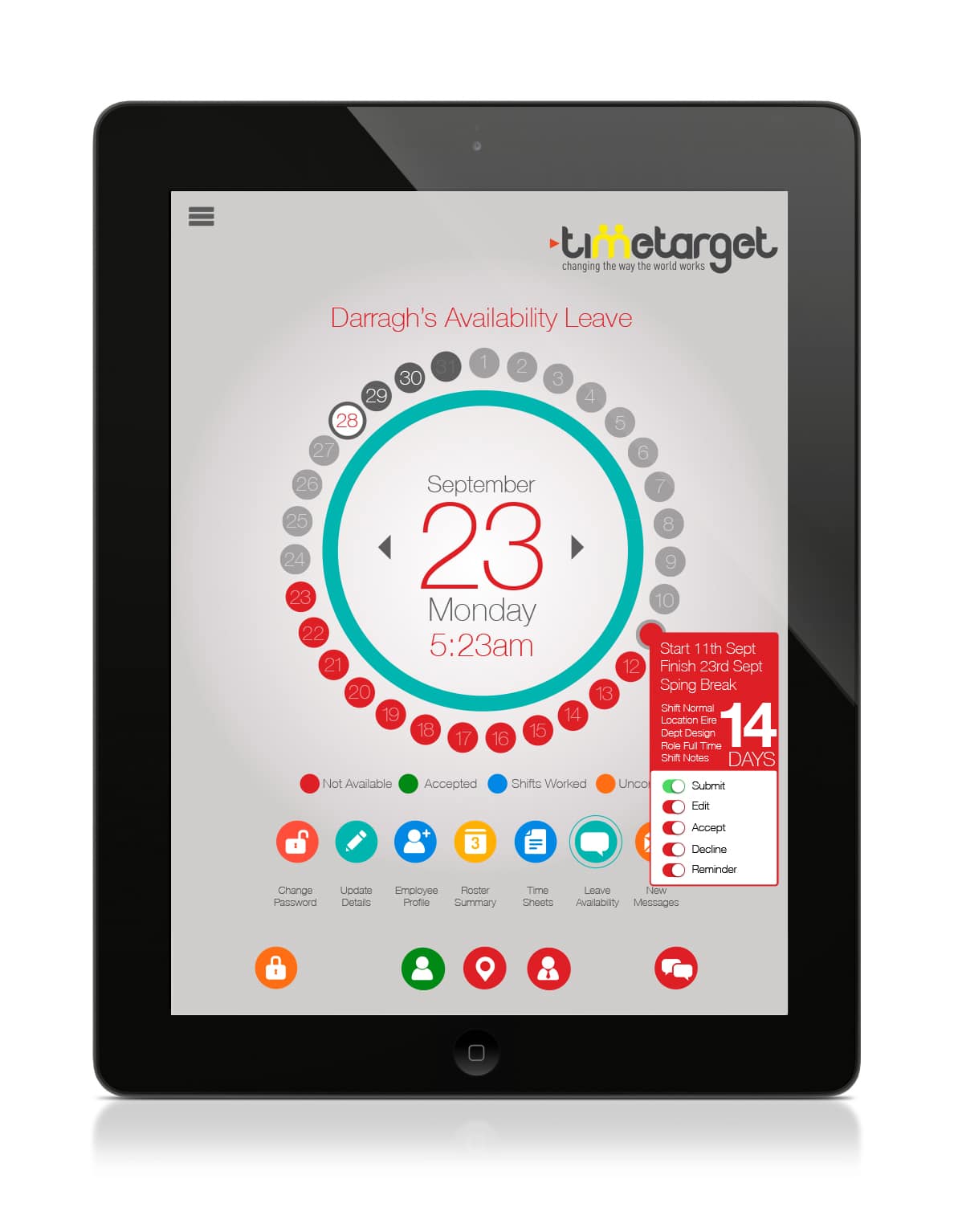
From Tables to Timepieces
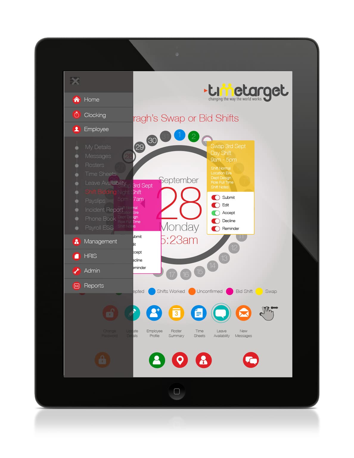
The old shift tables were unreadable. We redesigned them around a clock-face metaphor. Circles, icons, and time-based logic — because when you think of work hours, you think of watches. It's intuitive. It's visual. It works.
Design That Knows Its Audience
Staff needed quick clarity. Managers needed control. We created user flows tailored to each role. Actions like accepting or swapping shifts became tap-and-go easy, whether you were a frontline worker or a rostering lead.
Designing for Humans, Not Just Systems
At Wowwee Design, we believe UX is about empathy. It's not just what a system can do — it's how it feels to use. We put people first in every decision: layout, iconography, colour, and function.
Software Companies, Let’s Talk
If your software works well but looks like a relic, you’re not alone. Many great platforms suffer from bad UI. We’d love to help you reimagine what your product could look like — and how good it could feel to use.