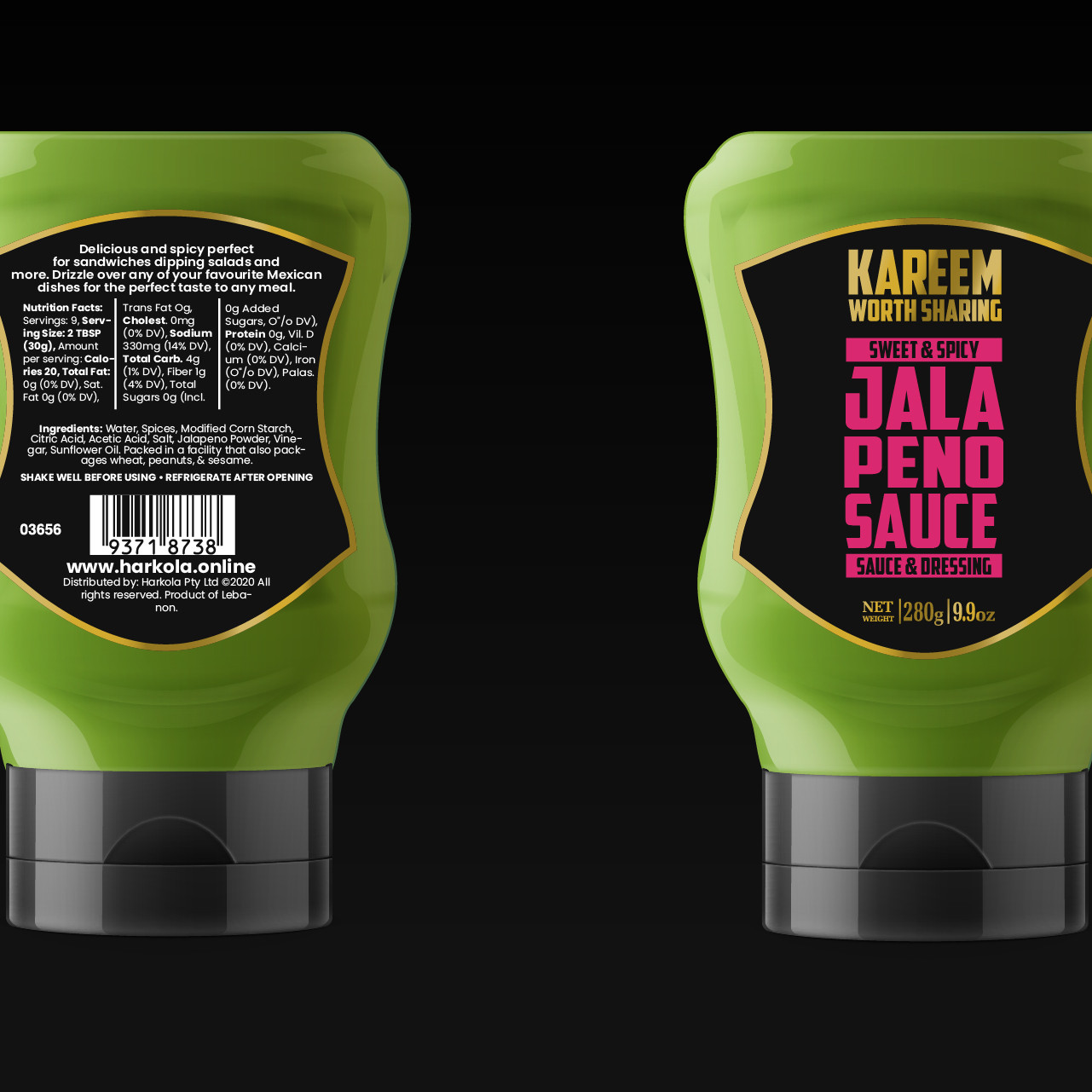
Ignite Your Taste Buds with Kareem's Table Sauces
When it comes to food, flavour is everything. Kareem’s Table Sauces Packaging Design bring you an explosion of tastes that turn any meal into a masterpiece.
Packaging Design That Pops
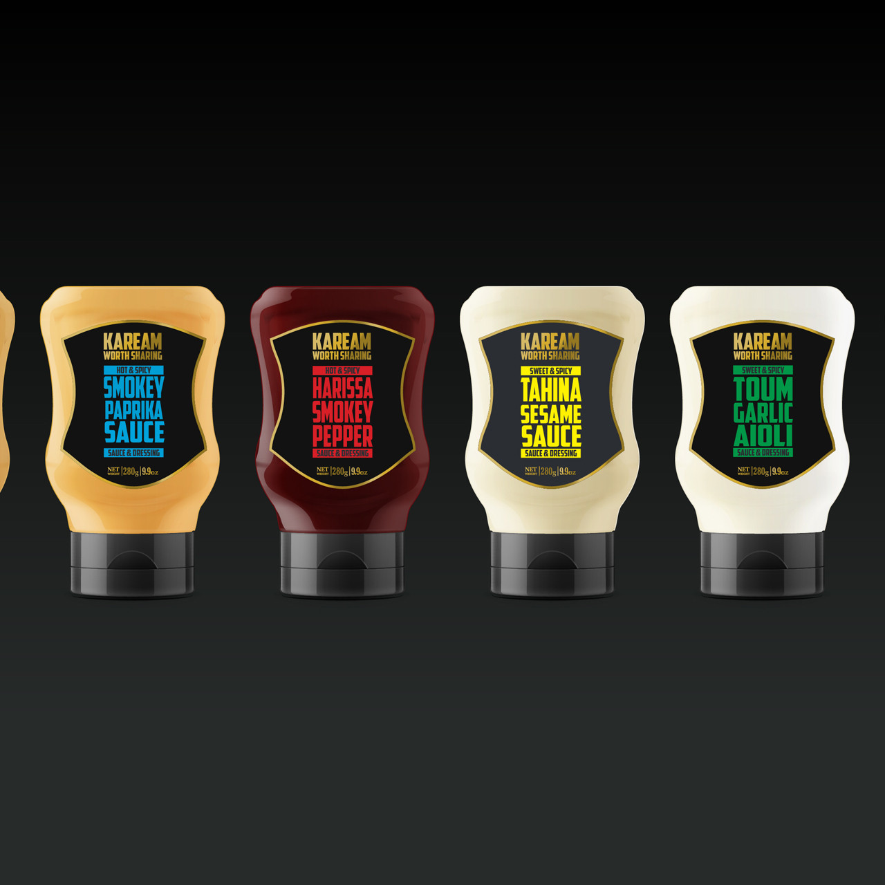
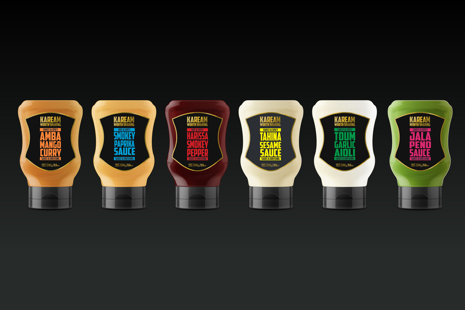
At Wowwee Design, we crafted packaging as bold as the sauces themselves. Every bottle is designed to grab attention and reflect the vibrant flavours inside.

A Feast for the Eyes
The visual identity was key for us. The sleek Packaging Design, modern typography combined with distinctive colours ensures Kareem’s sauces stand out on any shelf.

Sweet Meets Spicy
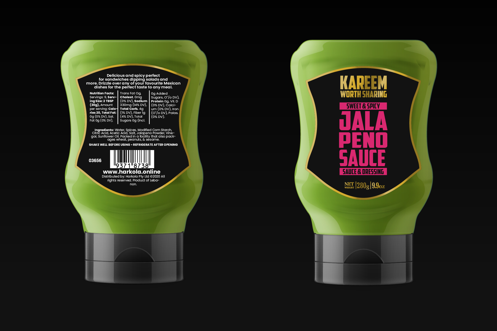
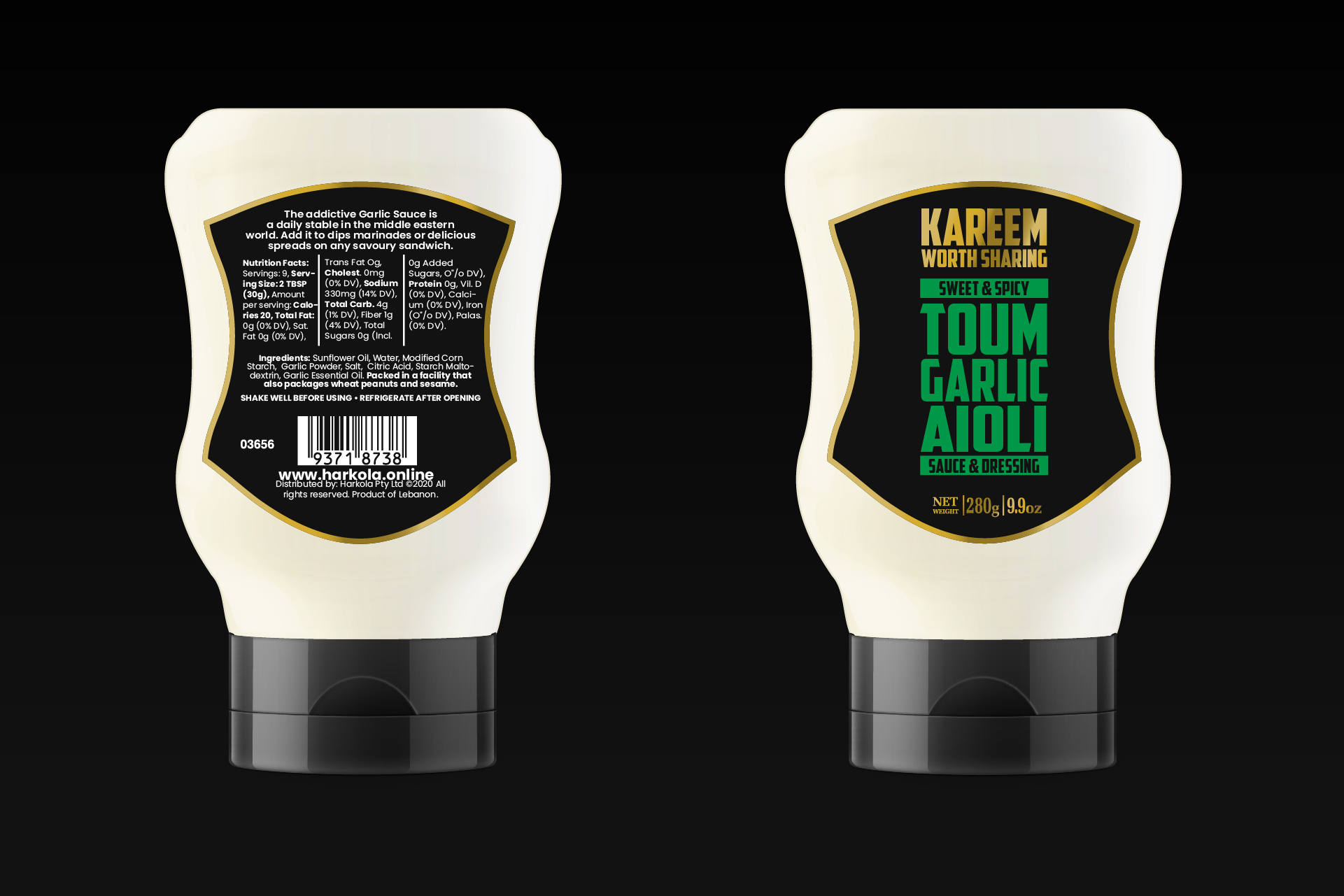
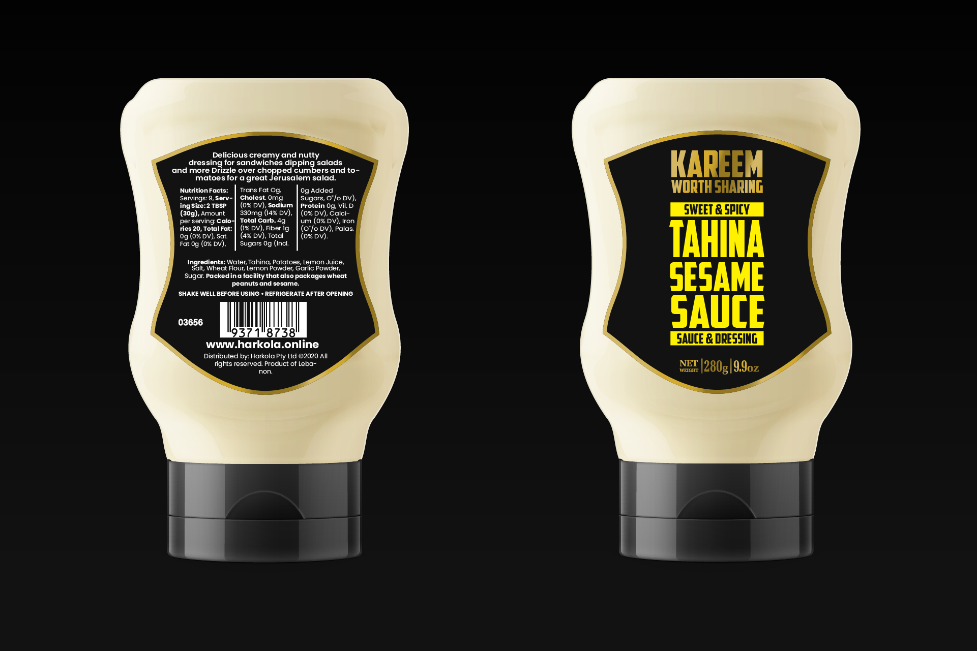
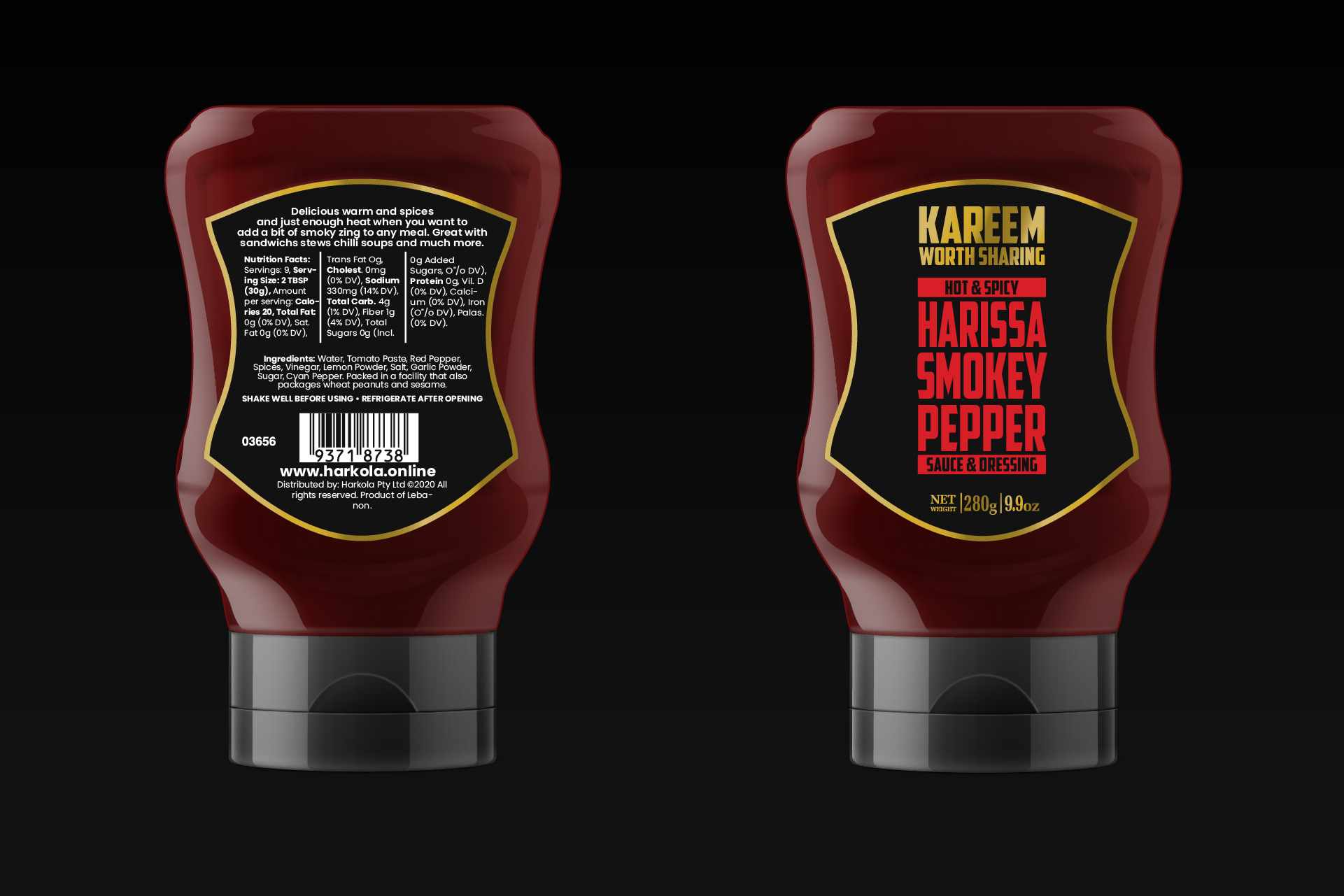
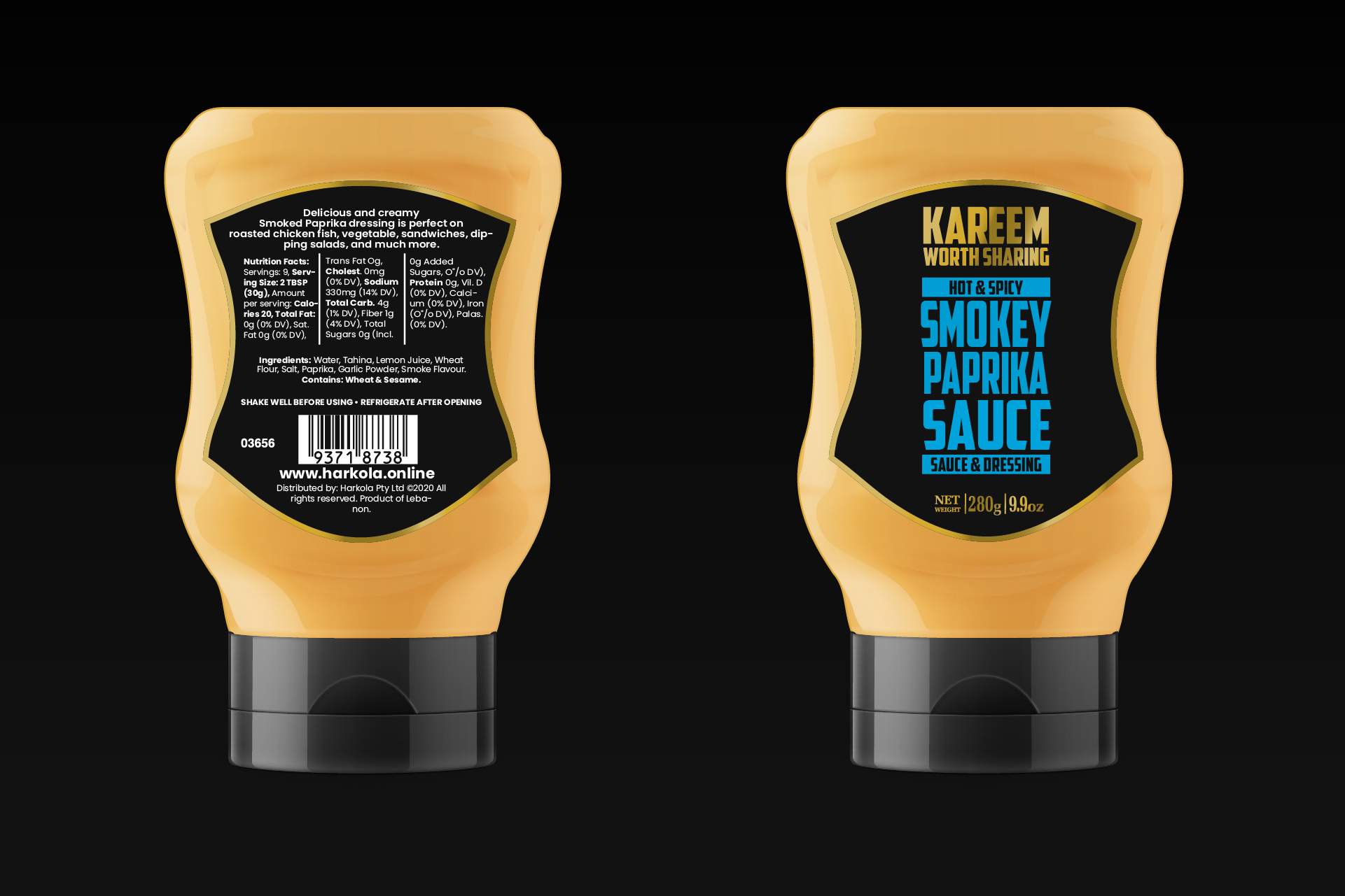
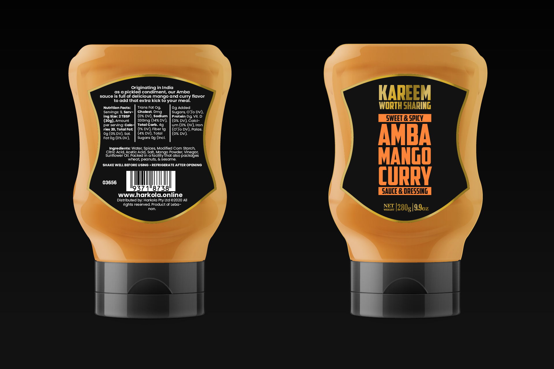
With flavour profiles like Amba Mango Curry and Smokey Paprika Sauce, we embraced the bold personality of each sauce in both Packaging Design and function.

Minimalism with a Twist
We wanted the design to be simple yet impactful. The curved bottles and sharp label contrast create a balance between elegance and modernity.

Logos Worth Sharing
Our approach to the logo was to reflect Kareem’s brand ethos, "Worth Sharing". Every logo detail was carefully considered to embody quality and warmth.

A Palette of Possibilities
The typography choices were inspired by the vibrant variety of the sauces themselves. The bold, dynamic fonts communicate the richness of the flavours in the Packaging Design.
Visual Hierarchy that Works
We built a clear structure into the packaging, ensuring the flavour name is the first thing consumers notice, while also providing essential information at a glance, thus meaning great packaging design.
Designed to Delight
From the distinctive Harissa Smokey Pepper to the smooth Tahina Sesame Sauce, each label was crafted with precision to elevate both the visual and tactile experience.
Attention-Grabbing Design
Each sauce label is a visual statement. We paired striking colours with bold fonts to create packaging that not only catches the eye but sparks curiosity.