Canna Holdings Branding – Medicinal Cannabis Branding in Australia
Introducing Canna Holdings
Canna Holdings is a forward-thinking Australian medicinal cannabis company. As the industry grows rapidly, they needed a brand identity that reflected professionalism, compliance, and trust while still standing out in a highly competitive market.

The Brief
Canna Holdings approached Wowwee Design to create a complete branding package that would not only comply with regulatory guidelines but also appeal to investors, patients, and healthcare professionals. The goal was to communicate credibility without falling into clichéd design tropes.

Branding Strategy and Positioning
We began by defining the brand’s positioning—professional, modern, and health-oriented. The strategy focused on bridging the clinical nature of the product with the warmth and care required in healthcare communications.
Brandmark and Logo Design
The logo design features a minimalist, medical-inspired symbol with a green and charcoal palette that reflects both nature and science. The mark subtly references a cannabis leaf without being overt, creating a clean and confident identity.

Typography and Colour Palette
We selected a contemporary sans-serif typeface that conveys clarity and trust, paired with a restrained colour palette of muted green, white, and deep grey. These tones ensured legibility while evoking calm, wellness, and precision.

Packaging and Label Design
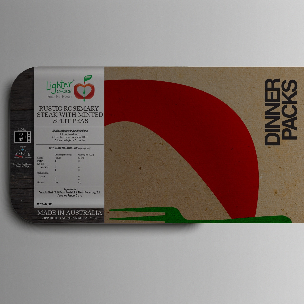
For medicinal cannabis packaging, compliance is everything. We developed packaging templates that adhered to strict legal guidelines, with clear product information, batch numbers, and safety labels, while still maintaining a premium, clean look.

Website Design and Digital Collateral
The digital presence for Canna Holdings needed to be informative and accessible. We designed a sleek, responsive website that included information for medical professionals, investors, and patients. The interface was intuitive, with clear calls to action and secure contact forms.

Investor Pitch Materials
To support capital raising, we created a polished investor presentation deck and executive summaries. These assets combined our brand visuals with clear data, strong messaging, and sharp infographics—designed to instil confidence and clarity.

Photography and Imagery Style
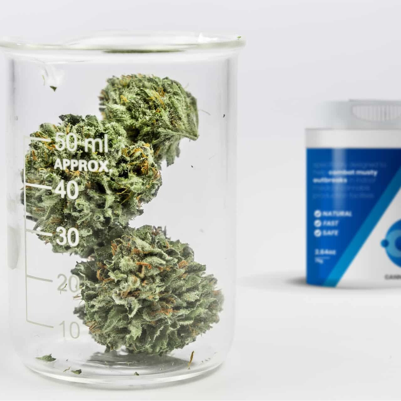
We curated a suite of medical-themed lifestyle imagery, blending science and wellness. Clean lab environments, natural leaf textures, and macro product shots helped humanise the brand and balance its clinical tone.

Results and Brand Impact
Since launching the new brand identity, Canna Holdings has reported stronger investor engagement and improved stakeholder clarity. Their market presence feels sharper, more trustworthy, and visually aligned with international competitors.