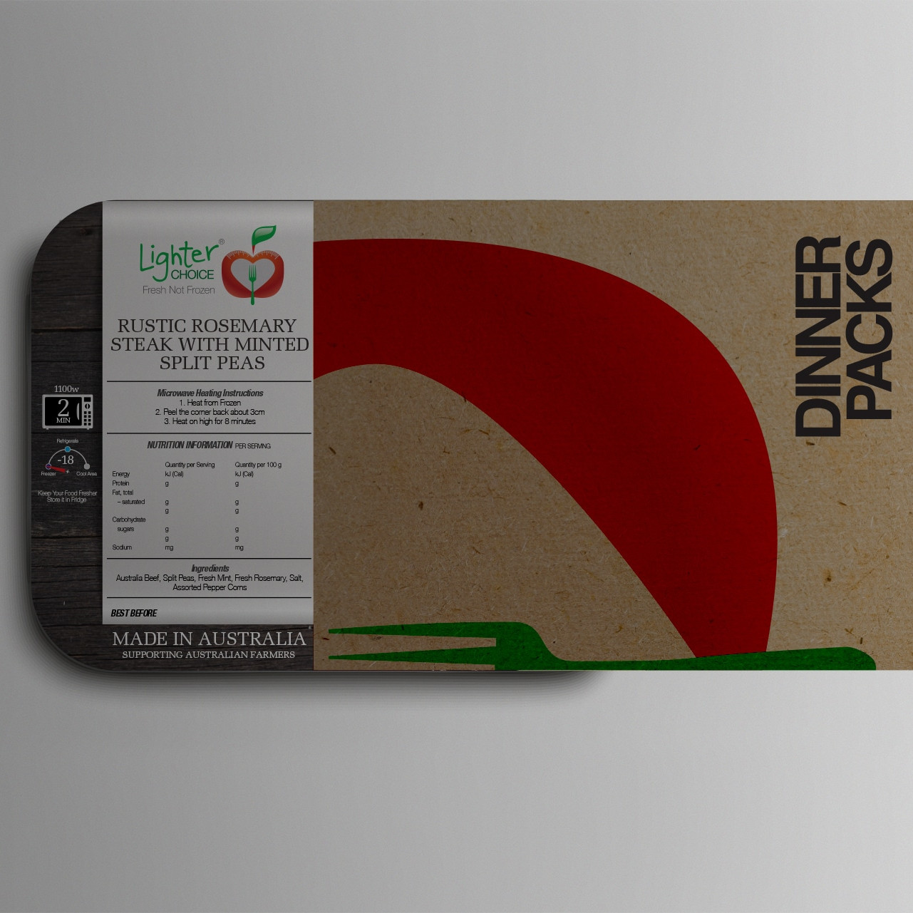
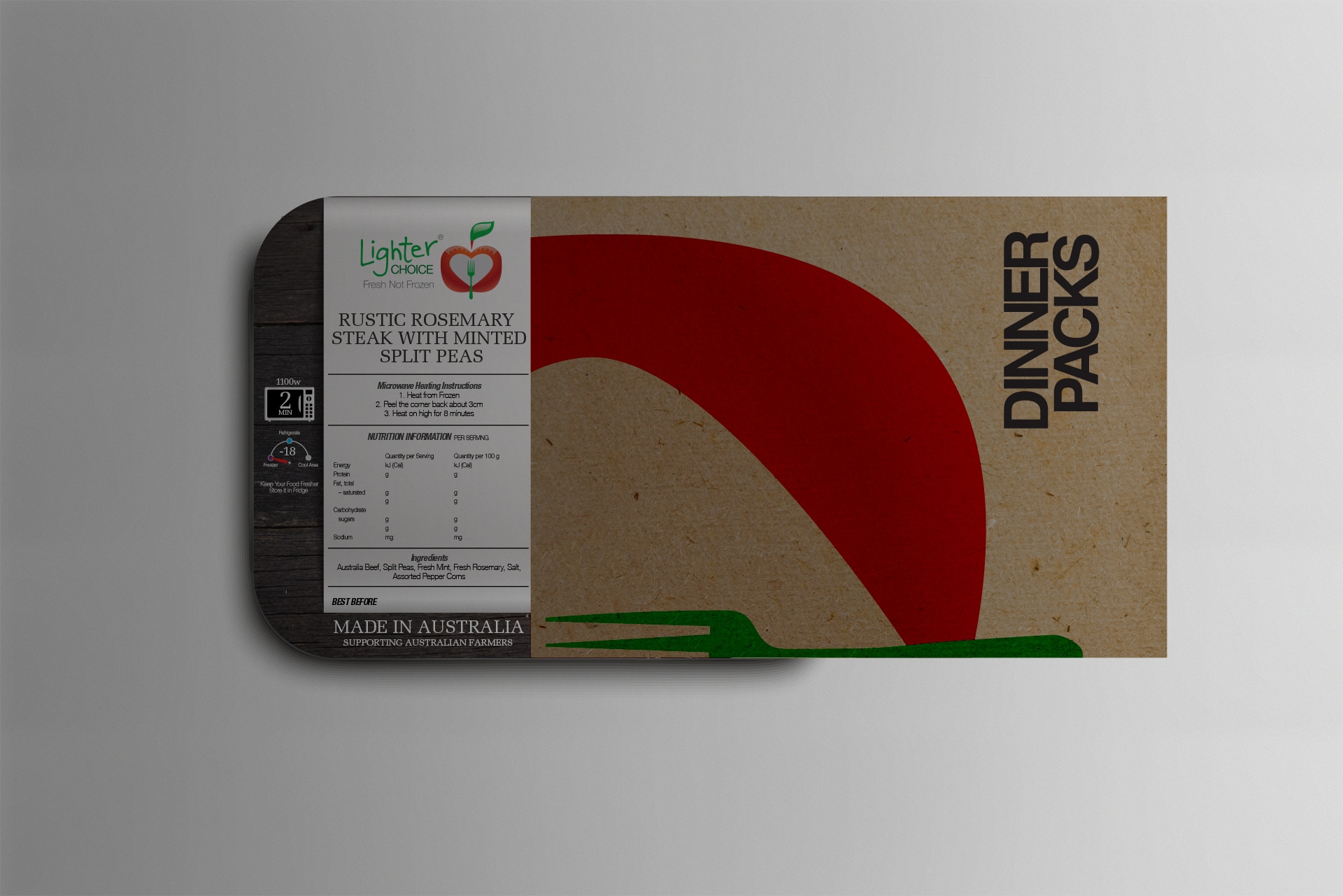
Lighter Choice is a health-focused ready meal service offering convenient food delivery solutions to those pursuing a better lifestyle. They approached Wowwee Design to create a brand that could communicate health, simplicity, and weight-loss support without feeling clinical or bland.
The Creative Brief
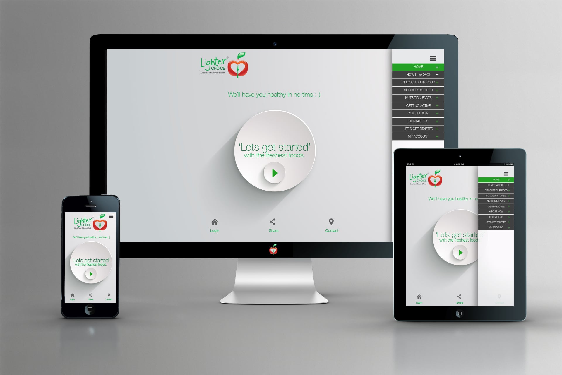
The brief was to design a logo and packaging system for Lighter Choice’s ready-made meals, sub-brands for gym and nutritionist programs, and a cohesive visual identity that could roll out across multiple customer touchpoints—from delivery boxes to digital platforms.
A Brand Built on Symbols of Health
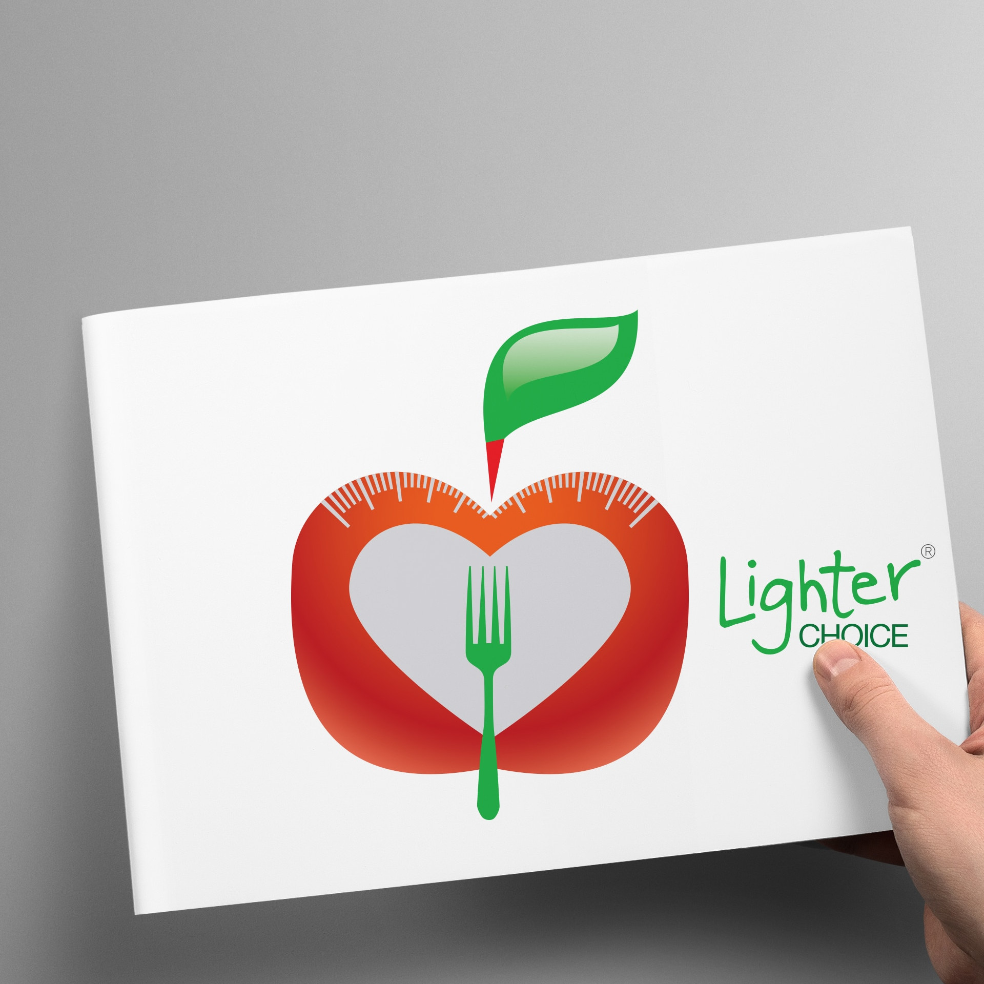
We crafted a brandmark using four integrated icons: an apple (health), a heart (wellbeing), a fork (eating), and scales (weight loss). The final symbol became instantly recognisable, versatile, and full of meaning—exactly what a health brand needs in a crowded space.
A Colour System for Sub-Brands
To distinguish sub-sections of the business (e.g. nutritionist services, fitness partners), we introduced a flexible colour system. Each area had its own visual identity while remaining aligned to the Lighter Choice master brand—great for franchise potential or future scalability.
Typography That Feels Clean and Approachable
We chose a contemporary, geometric sans-serif typeface with a friendly but structured feel. Legibility was key, especially for customers reading ingredient lists and nutritional info at a glance.
Packaging That Does the Heavy Lifting
From vacuum-sealed meals to printed sleeves and sticker systems, we designed packaging templates that balanced compliance and creativity. Clean layout, strong hierarchy, and easy-to-read callouts made this a packaging system that supported sales and built trust.
Web and Digital Consistency
We extended the brand across digital platforms, with a focus on UX, clear visuals, and easy access to subscription options. The design helped reduce bounce rates and gave users a smooth, trustworthy experience.
Supporting Nutritionists and Gym Partnerships
The branding package included materials for third-party providers—such as nutritionists and gyms—who could white-label the product. We created flexible brand assets so they could co-brand without diluting the core Lighter Choice identity.
Brand Guidelines for Growth
To maintain brand consistency across teams and partners, we produced a comprehensive brand guideline. This covered logo usage, colours, fonts, photography, tone of voice, and more—ensuring every touchpoint aligned with the brand’s mission.
Outcome: Strong Visual Identity, Stronger Sales
Lighter Choice saw an immediate lift in perceived value and user engagement. Customers responded well to the professional, friendly identity and the simple, honest presentation of meals. The design helped them scale confidently.
Building Healthier Brands, One Choice at a Time
This project proves that health brands don’t need to feel sterile. By focusing on clarity, emotion, and strategic design, Wowwee Design delivered a ready-to-grow brand system that looks as good as the meals taste.