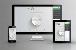
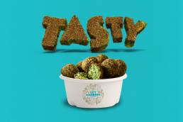
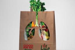
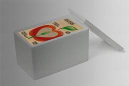
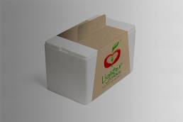
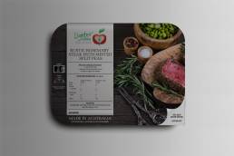
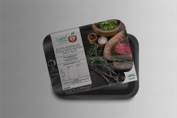
Lighter Choice Ready Made Food Deliver Services
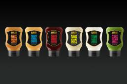
We all understand the task of doing a branding exercise it can be costly and very time consuming, but the reward always out weights the time & cost. The secret to a successful branding exercise is to make sure you have a good scope of whats needed to be done. A Wowwee Design we provide a comprehensive brief building so we all know what needs to be done. It usually starts with the design of a logo, and how its going to be used across the various mediums or channels. Logo design, Packaging Design, Website Design, or any other mediums provide a platform for us to sell our business products.
Logo Design
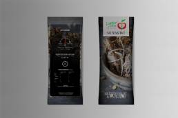
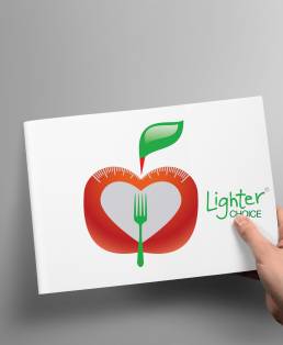
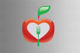
The Lighter Choice Logo Design was created by Wowwee Design. It involves the very basic element of health the Apple. Within the centre of the logo is a heart which is the result of what healthy food dose for your body, Healthy food, gives you a healthy heart. The Logo Design also has some extra symbols. The fork in the centre also combines with the heart that symbolises the growth of fresh healthy food. The last element within the logo is the scales across the top of the Apple which symbolises the the the loss of weight from eating healthy food.
Logo Uses
The logo is adapted within the brand guidelines, we show how the company and its future plans so how they are going to use the logos for not just the food business but Also A Gym Logo, and Nutritionalist Clinic Logos. You'll see that they are all made of the same symbol elements still hold a brand presence.